Bubble Charts are probably the sexiest types of graphs in statistics. They are so seductive (for non-statisticians)!
They are incredibly easy to get wrong, though.
Knowing what type of chart to use to compare data and how to format it for maximum effectiveness can be tricky - and it can make or break your entire presentation!
It's not as difficult as you think, though.
If you want to engage your audience and produce well-crafted Bubble Charts that have the potential to change the world, there are just a few simple data visualisation best practices that you need to follow.
And they are all here!
Disclosure: we may earn an affiliate commission for purchases you make when using the links to products on this page. As an Amazon Affiliate we earn from qualifying purchases.
In this guide on how to choose the right chart for your data, I’ll explain about the different types of Bubble Charts you’ll come across.
Then I’ll show you which data goes on which axis and how to set them up properly.
I’ll show you the different types of Bubble Charts to use, and how to choose the right chart for your data.
We’ll move on to how to style your Bubble Charts and review them with a critical eye to decide what should go on your graph, and – more importantly – what you should take off.
FREE DataViz Flowchart
Master the Fundamentals of Data Visualisation
Ultra-Hi-Definition PDF
By the time you’ve read this dataviz guide, you’ll know more about plotting charts than pretty much everyone around you!
Your DataViz Jump-Station
This post is part of a series of articles about the most used types of graphs in statistics for presenting data.
You can use the following jump-station to choose the content you're looking for (and there will be another jump-station at the bottom of this post):
DataViz Jump-Station
This post is part of a series on the most used graphs in statistics.
For more detail, choose from the options below:
DataViz:
How to Choose The Right Chart for Your Data
Bubble Chart
What is a Bubble Chart?
A Bubble Chart is a type of chart that shows three dimensions of data on two-dimensional axes. The Bubble Chart is an extension of the Scatter Plot (used for two dimensions of data) in that the data points are replaced by bubbles representing an additional dimension of numerical data.
Bubble Charts - How to Choose the Right Chart for Your Data @chi2innovations #datavisualization #charts
What does a Bubble Chart show?
A Bubble Chart is similar to a Scatter Plot but is used when there is a third numerical variable, which is shown as the size of the bubble, and is very powerful for visualising the relationships between 2 or more variables with multiple dimensions.
VIDEO COURSE
Statistics:
The Big Picture
Free to try - no need to buy or register!
Types of Bubble Chart
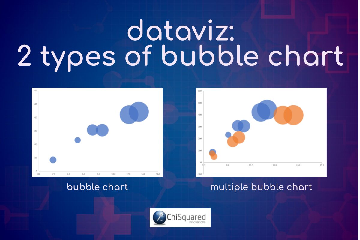
There are 2 basic types of Bubble Chart you’ll come across in statistics (although there are many others that are not recommended, such as 3D Bubble Charts or Packed Circle Charts):
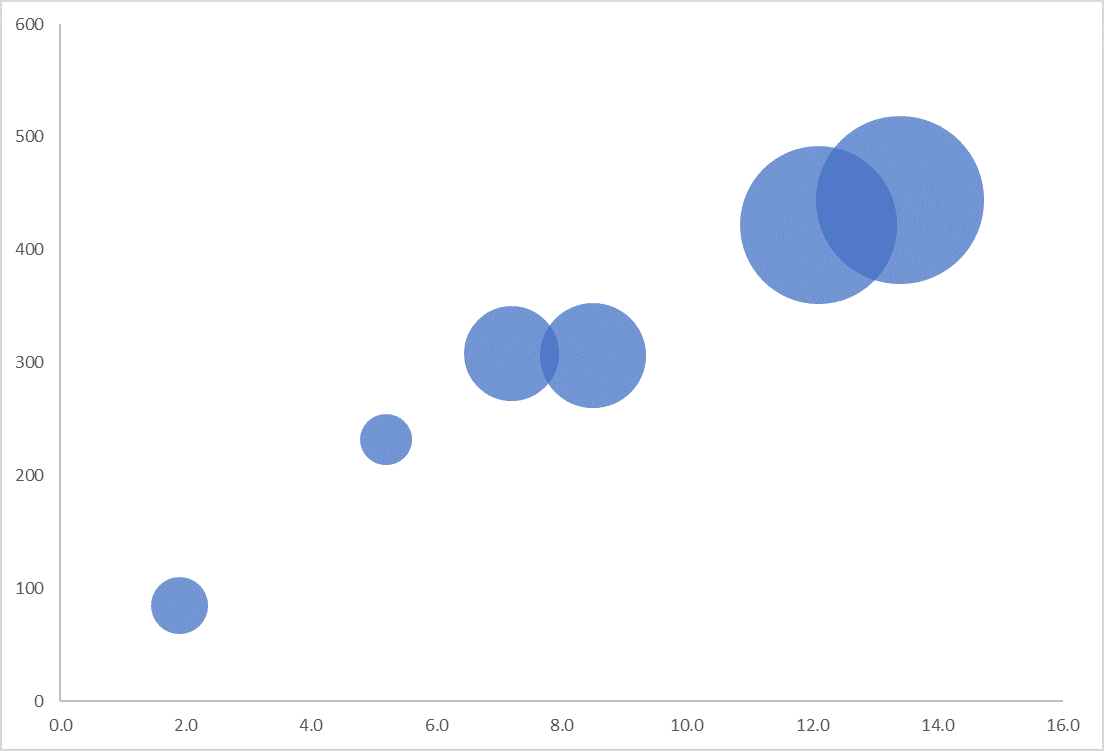
Bubble Chart.
The simplest type of Bubble Chart is to plot your numerical variable of interest on the y-axis against an independent numerical variable on the x-axis, using a third numerical variable to scale the size of the resulting bubbles. Bubble Charts can be useful to display visual correlations, but the values of the third dimension can be difficult to understand.
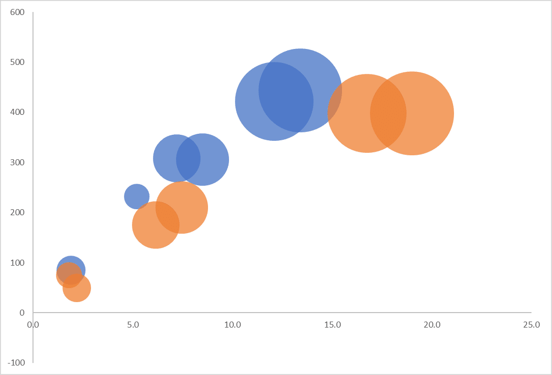
Multiple Bubble Chart.
When you have a second series of data that you wish to compare, you can plot them on the same Bubble Chart, giving them a different colour to the first series. This is called a Multiple Bubble Chart. Care must be taken not to plot too many series on a Multiple Bubble Chart – more than 2 or 3 series can be very confusing.
Bubble Chart Example
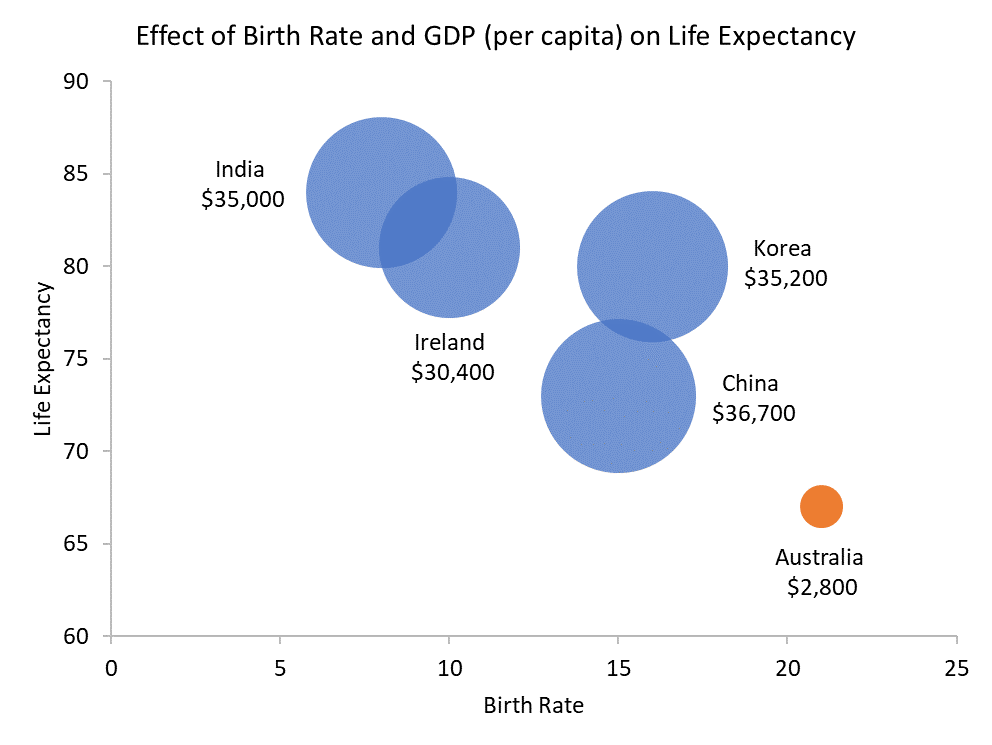
For example, if you were investigating the effect of birth rate and GDP on life expectancy, you could birth rate on the x-axis and life expectancy on the y-axis of a Bubble Plot, with GDP represented as the area of each bubble, like this:
Bubble Chart Example – Interpretation
As Bubble Charts are the same as Scatter Plots, but with an added dimension (bubble size), the same conventions of interpretation apply.
So, let’s apply these same rules to our Bubble Chart example.
The general trend of the data is downwards from left-to-right, indicating that there is a negative correlation between birth rate and life expectancy – that the more likely you are to survive at birth, the shorter your lifespan will be. It is interesting to note that per capita GDP has no effect on life expectancy, as most of these nations have similar GDP numbers.
Why is birth rate negatively correlated with life expectancy? You would imagine that birth rate would be positively correlated to life expectancy due to higher levels of education and technology, but these data suggest otherwise.
You might also imagine that higher per capita GDP would also lead to longer lifespans, but again, these data suggest not.
Why do India, China and Korea – geographic neighbours – have very different birth rates and life expectancies?
Also note that Australia is an outlier in these data – its GDP is far smaller than that of the other nations.
It looks like more research is needed to gain a greater understanding of the story of these data!
FREE DataViz Flowchart

Master the Fundamentals of Data Visualisation
Ultra-Hi-Definition PDF
When To Use Bubble Charts
You would use a Bubble Chart (3 numerical variables) when a Scatter Plot (2 numerical variables) is appropriate but you have an additional dimension that you want to show.
Bubble Charts are particularly useful when you wish to present patterns in large data sets, trends, correlations, clusters or outliers.
When To Avoid Bubble Charts
Bubble Charts have the same disadvantages as Scatter Plots – avoid if you have small data sets or if there is no relationship between the variables.
Bubble Charts - Best Practice
Whilst Bubble Charts are probably the sexiest types of graphs in statistics, it's easy to get it wrong, format it poorly and completely deceive your audience.
And nobody wants that, least of all you. Or your boss.
Hopefully, you now have a much better understanding of Bubble Charts, when to use them, what type of chart to use to compare data, and how to present your chart to inspire those around you to change the world for the better.
Pin it for later
Loved it?
Pin it to your favourite board!
Your DataViz Jump-Station
Looking for your next step?
You can use the following jump-station to choose the content you're looking for:
DataViz Jump-Station
This post is part of a series on the most used graphs in statistics.
For more detail, choose from the options below:
DataViz:
How to Choose The Right Chart for Your Data


