Data visualisation is sexy – probably the sexiest part of statistics, Data Science and business intelligence.
And it can make or break your study!
Few people that have to create charts as part of their study know and understand how to create charts for maximum effectiveness, and as a result struggle to engage their audience.
And that’s a shame, because a well-crafted chart has the potential to change the world!
Charts really are that important!
Disclosure: we may earn an affiliate commission for purchases you make when using the links to products on this page. As an Amazon Affiliate we earn from qualifying purchases.
In this guide on how to choose the right chart for your data, I’ll explain about the different types of graphs you’ll use.
Then I’ll show you which data goes on which axis.
I’ll show you the different types of charts to use, and how to choose which ones to use.
We’ll move on to how to style your charts and review them with a critical eye to decide what should go on your graph, and – more importantly – what you should take off.
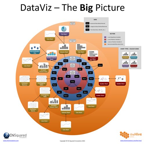
Finally, I’ll introduce you to DataViz – The Big Picture, a FREE Ultra-High-Definition flowchart that will guarantee that you get the right chart first time, every time!
(psstt - don't tell anyone, but you can get a FREE copy right here:)
FREE DataViz Flowchart
Master the Fundamentals of Data Visualisation
Ultra-Hi-Definition PDF
By the time you’ve read this dataviz guide, you’ll know more about plotting charts than pretty much everyone around you!
Your DataViz Jump-Station
This post is part of a series of articles about the most used types of graphs in statistics for presenting data.
You can use the following jump-station to choose the content you're looking for (and there will be another jump-station at the bottom of this post):
DataViz Jump-Station
This post is part of a series on the most used graphs in statistics.
For more detail, choose from the options below:
DataViz:
How to Choose The Right Chart for Your Data
How Many Variables Can Be on a Graph?
One of the first problems that most people encounter when they’re plotting graph variables is deciding how many variables to add to their graph – particularly if they’re in the exploratory phase of their analyses rather than at the story-telling stage.
Before you can decide how many graph variables to include, it’s useful to understand their data types, and this will have a huge influence on how many graph variables you can include – and on which types of graphs you can use.
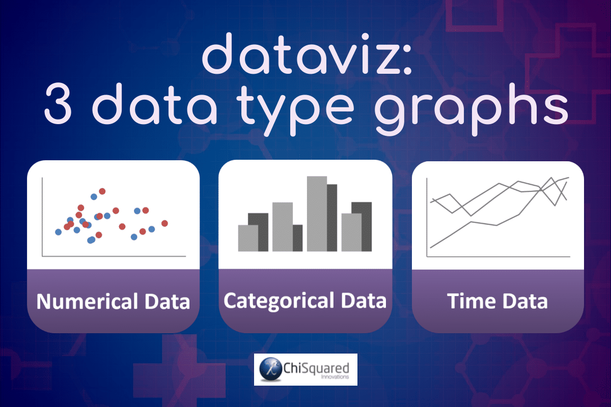
There are just 3 types of data graphs in statistics:
Numerical Data Graphs
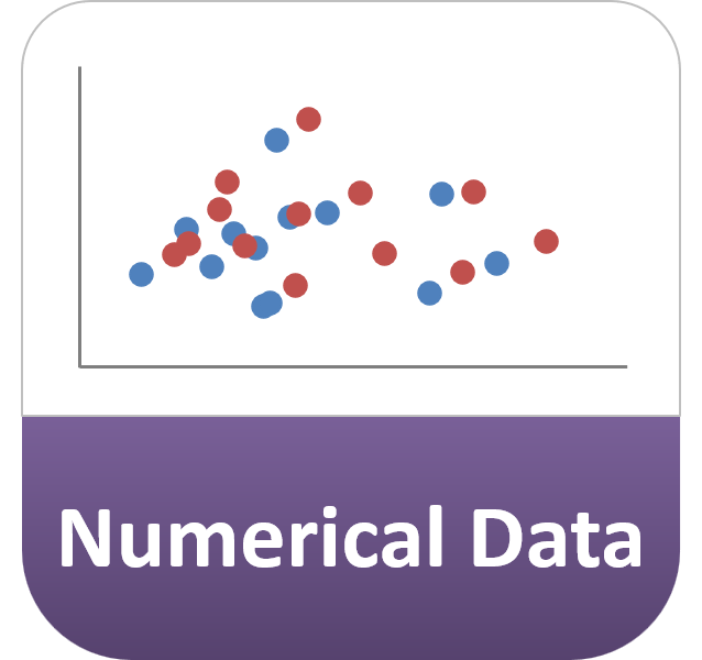
Numerical data graphs (aka quantitative data graphs or graphs for continuous data) are the graph types on which we are plotting only numerical data (on both the x- and y-axes).
Height (e.g. 1.6m) and Weight (e.g. 263kg) are examples of numerical data (aka continuous data or quantitative data).
So which graphs are used to plot continuous data? Well, we’re plotting numerical data on both axes, but it is important to note that the feature of interest is always plotted on the y-axis (more on that in the next section).
Numerical Data Graphs - Example
Examples of numerical data graphs include:
Categorical Data Graphs
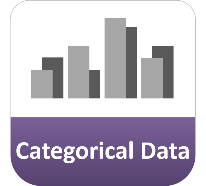
Categorical data are data arranged in categories, such as Size [Small, Medium, Large], and graphs using categorical data are called categorical data graphs.
Categorical Data Graphs - Example
Examples of categorical data graphs where the x-axis is arranged in categories (and the numerical feature of interest variable is on the y-axis) include:
Examples of categorical data graphs where the categorical feature of interest is plotted on the y-axis and the numerical variable is on the x-axis include:
Time Data Graphs
When Time is the feature of interest, such as how long it takes to run the 100 metres, then you would usually consider Time as a numerical variable and plot it on the y-axis. The type of graph you use depends on whether your x-axis is a numerical variable or categorical variable (as discussed above).
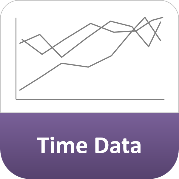
On the other hand, when you want to see how the feature of interest varies over time, you plot your variable against time on a Time Data Graph. In this case, Time is always plotted on the x-axis, with the variable(s) of interest plotted on the y-axis.
Time Data Graphs - Example
Examples of time data graphs include:
3 Data Type Graphs - Summary
So, as a reminder, here are the 3 different data type graphs again:
So How Many Variables Can Be on a Graph?
The unfortunate answer to this question is that there is no limit to the number of variables you can add to your graphs. Whether you’re using a Bar Chart, a Column Chart, a Scatter Chart or a Line Chart, you can plot as many graph variables as you wish!
But why would you want to?
The more graph variables you plot, the harder it is to see patterns and trends. At an early investigation stage, it might be useful to plot lots of variables on a single chart to see if you can spot an outlier, but mostly you’ll just end up with a lot of confusing mush!
Try to limit the number of variables on your graphs to the smallest number needed to tell the story of your data.
And don’t forget, if a picture paints a thousand words, then two pictures tell twice the story. Plotting more graphs with fine detail is better than plotting few graphs full of confusion!
DataViz - How to Choose the Right Chart for Your Data @chi2innovations #datavisualization #charts
How Do You Know Which Variable to Put on Which Axis?
Statisticians are really strict about this, so pay attention.
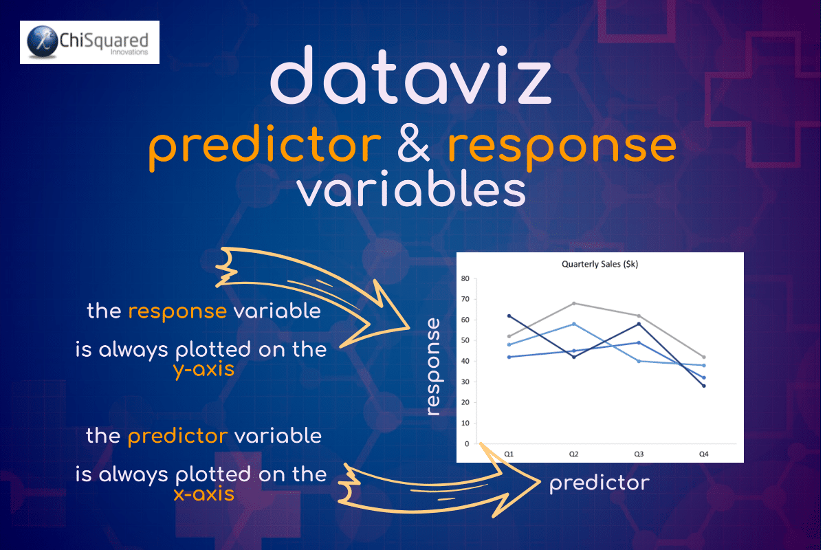
The variable that contains the feature of interest is known as the Response Variable (aka dependant variable, y-variable, outcome variable or hypothesis variable).
The Response Variable is always plotted on the y-axis.
On any graph, there will only ever be one Response Variable, but there may be multiple Predictor Variables (aka independent variable, x-variable, input variable or explanatory variable).
The Predictor variable is always plotted on the x-axis.
The bottom line here is to decide which variable you’re interested in studying.
If you’re studying how the Weight of schoolkids (of the same age) is affected by their Height, then Weight is the variable of interest and goes on the y-axis. Height then goes on the x-axis and you would plot them using a Scatter Chart, or on a Column Chart if the Heights are categorised.
How Do You Decide Which Type of Chart to Use?
Asking the right questions will form the basis for choosing the right data visualisation chart types for your data.
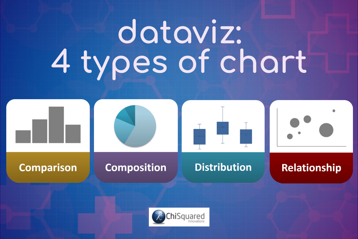
There are 4 questions to ask when deciding which type of chart to use:
- 1Do you want to compare variables?
- 2Do you want to show what a variable is composed of?
- 3Do you want to show the distribution of your data?
- 4Are you interested in analysing trends or relationships in your data?
Let’s delve a little deeper…
Do You Want to Compare Variables?
Charts are great for comparing variables or values within variables, and are ideal for showing highs and lows, outliers, before and after, and for showing how variables differ from each other. Typically, the types of charts used to compare data are:
Do You Want to Show What a Variable is Composed of?
If your aim is to show how individual parts make up the whole, then you need to use the right types of data visualisation to achieve this, charts such as:
Do You Want to Show the Distribution of Your Data?
Distribution charts help you to understand how your data are distributed, outliers, and where the centre of the distribution is. Mostly, distribution charts are used to assess individual variables, but they can also be used to compare variables too. One such data visualization chart type is:
Are You Interested in Analysing Trends or Relationships in Your Data?
If you are interested to know how a variable changed over time or as a result of its interaction with another, then you are investigating their relationship. These types of graphs in statistics are the most common and you will come across them time and again. Appropriate charts include:
VIDEO COURSE
Statistics:
The Big Picture
Free to try - no need to buy or register!
8 Types of Graphs in Statistics for Presenting Data
Although there are lots of data visualisation chart types, essentially there are only 8 main types of graphs in statistics for presenting data. If you master when and how to use these, you will have most of dataviz sewn up!
The 8 types of graphs in statistics for presenting data are:
- 1Column Chart or Bar Chart
- 2Line Chart
- 3Scatter Plot
- 4Bubble Chart
- 5Pie Chart
- 6Box and Whiskers Plot
- 7Contingency Table
- 8Confusion Matrix
Let’s jump in and take a look at each of them.
Column Chart vs Bar Chart
Firstly, we need to ask what is the difference between Column Chart vs Bar Chart. Yes, they are different beasts!
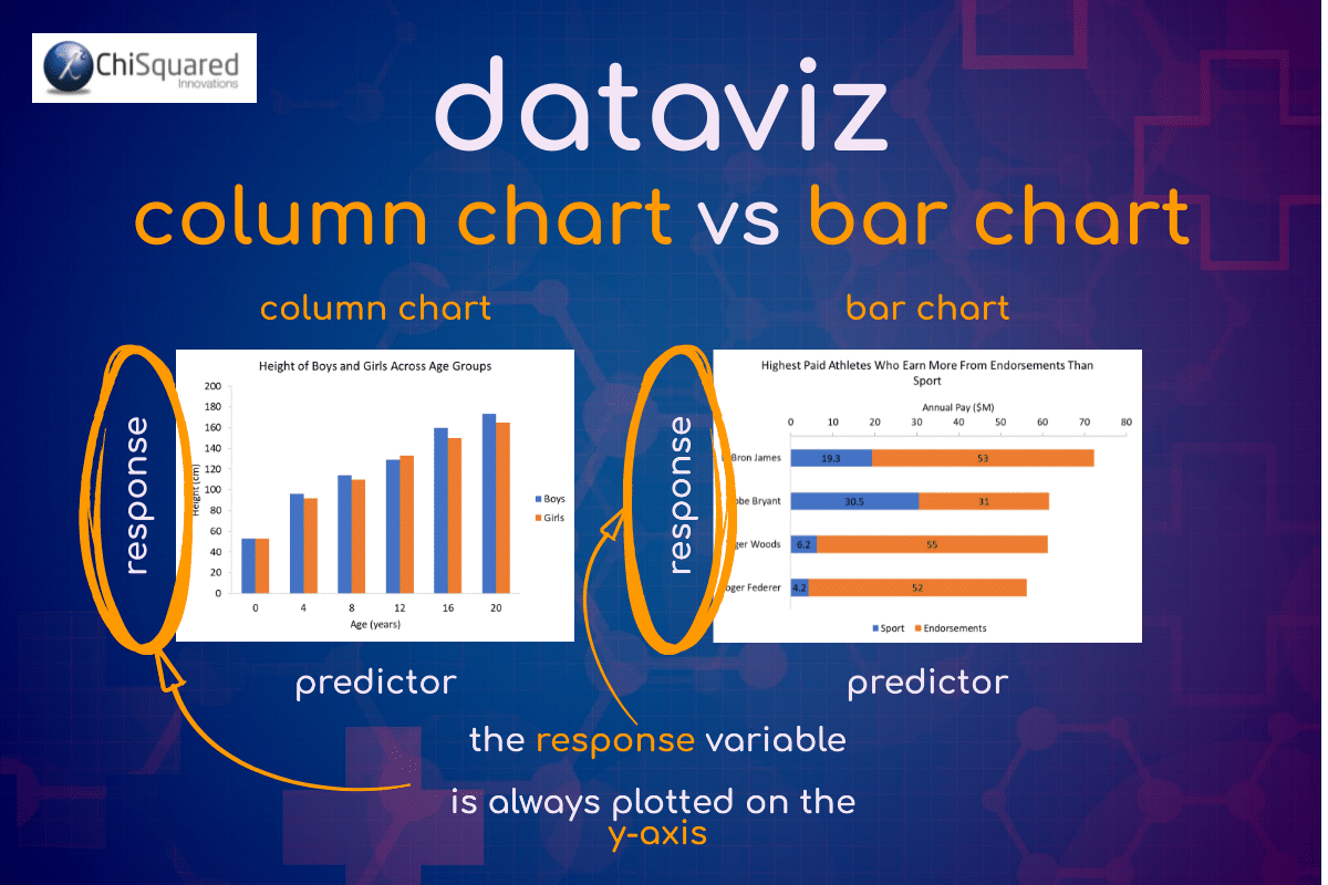
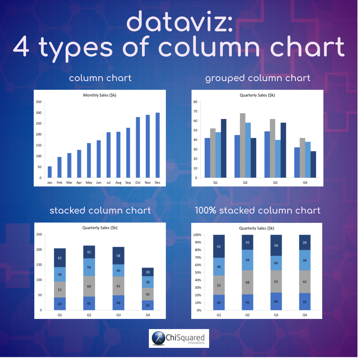
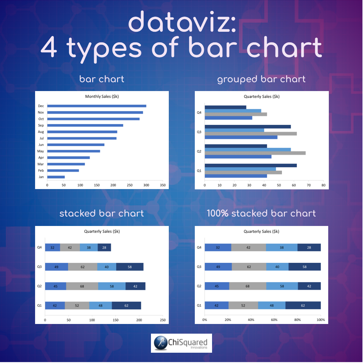
A Column Chart has vertical columns, whereas a Bar Chart has horizontal columns.
Simple, really!
Ah, yes, but when do you use each one?
Remember earlier when I said that your variable of interest goes on the y-axis? Well, that helps you answer this question.
You use Column and Bar Charts when one of your variables is categorical and the other is numerical.
Column Chart vs Bar Chart
When should you use a Column Chart? When your variable of interest is numerical it goes on the y-axis, the categorical variable goes on the x-axis, and you should use a Column Chart.
When should you use a Bar Chart? When your variables are the other way round and your variable of interest is categorical, your numerical variable goes on the x-axis and categorical variable on the y-axis – you should use a Bar Chart.
What does a Column Chart show?
A Column Chart summarises categorical data using vertical bars to represent the quantities of data for each category or it can show data changes over time by displaying a comparison among subjects.
Column Charts - Learn More...
If you would like to learn more about Column Charts, you can find a much more in-depth article via our DataViz Jump-Station (at the top and bottom of this post) or by clicking below (opens in a new tab):
What does a Bar Chart show?
A Bar Chart summarises categorical data using horizontal bars to represent the quantities of data for each category. Bar Charts are not usually used to show data changes over time.
Bar Charts - Learn More...
If you would like to learn more about Bar Charts, here is a much more in-depth article (opens in a new tab):
When To Use a Column Chart vs Bar Chart
Column Charts are best used to compare values for different categories or over a period of time for a single category. The feature of interest should be numerical and on the y-axis.
Bar Charts are best used to compare values for different categories where the categories themselves are the feature of interest, and as such should be plotted on the y-axis.
Line Chart
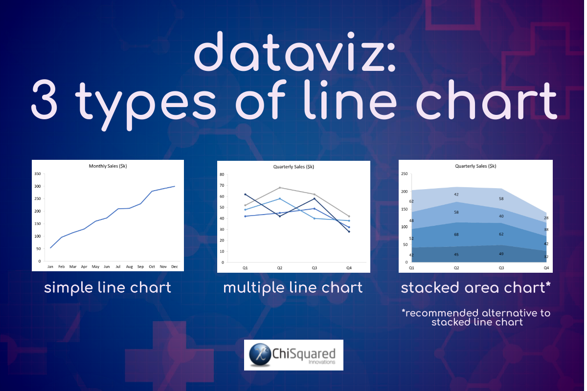
What does a Line Chart show?
A Line Chart is a graph that uses lines to connect individual data points, and is used most often to show how a numerical variable changes over time, but not always.
When To Use Line Charts
You use Line Charts when showing trend-based data visualisations over time or over categories. As such, the feature of interest is always numerical and is plotted on the y-axis. The x-axis may be categorical or time-based.
Line Charts are preferable to Column Charts when the number of categories is large, and/or when there are multiple numerical variables to show.
Line Charts - Learn More...
If you would like to learn more about Line Charts, here is a much more in-depth article (opens in a new tab):
Scatter Plot
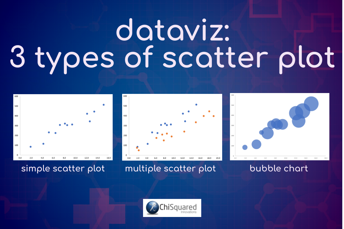
What does a Scatter Plot show?
A Scatter Plot shows the relationship between a pair of numerical variables. Before plotting your data, you should identify the variable with your feature of interest and plot this on the y-axis.
When To Use Scatter Plots
Scatter Plots are used when you’re looking for relationships between numerical variables, and are often accompanied by a trend line to help show correlations.
When the trend line rises from bottom left to top right, there is a positive correlation between the variables (this is not necessarily significant – you need a statistics test to confirm this), i.e. when the predictor variable (x-axis) increases, your feature of interest (y-axis) increases too.
When the trend line falls from top left to bottom right, there is a negative correlation – as your predictor variable increases, your feature of interest decreases.
When the trend line is (mostly) horizontal or vertical, there is no relationship between the variables.
Scatter Plots are particularly good for spotting outliers in your data set.
Scatter Plots - Learn More...
If you would like to learn more about Scatter Plots, here is a much more in-depth article (opens in a new tab):
Bubble Chart
What does a Bubble Chart show?
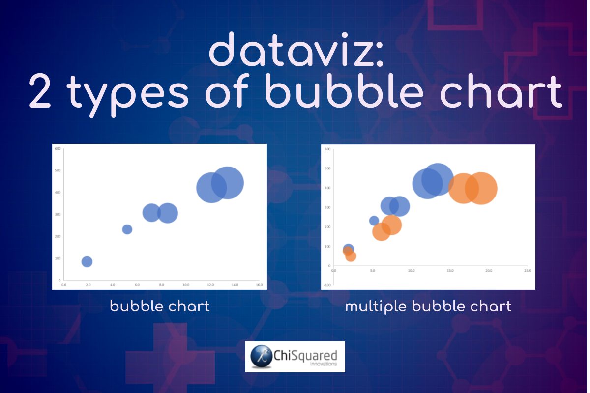
A Bubble Chart is similar to a Scatter Plot but is used when there is a third numerical variable, which is shown as the size of the bubble, and is very powerful for visualising 2 or more variables with multiple dimensions.
When To Use Bubble Charts
You would use a Bubble Chart (3 numerical variables) when a Scatter Plot (2 numerical variables) is appropriate but you have an additional dimension that you want to show.
Bubble Charts are particularly useful when you wish to present patterns in large data sets, trends, correlations, clusters or outliers.
Bubble Charts - Learn More...
If you would like to learn more about Bubble Charts, here is a much more in-depth article (opens in a new tab):
Pie Chart
What does a Pie Chart show?
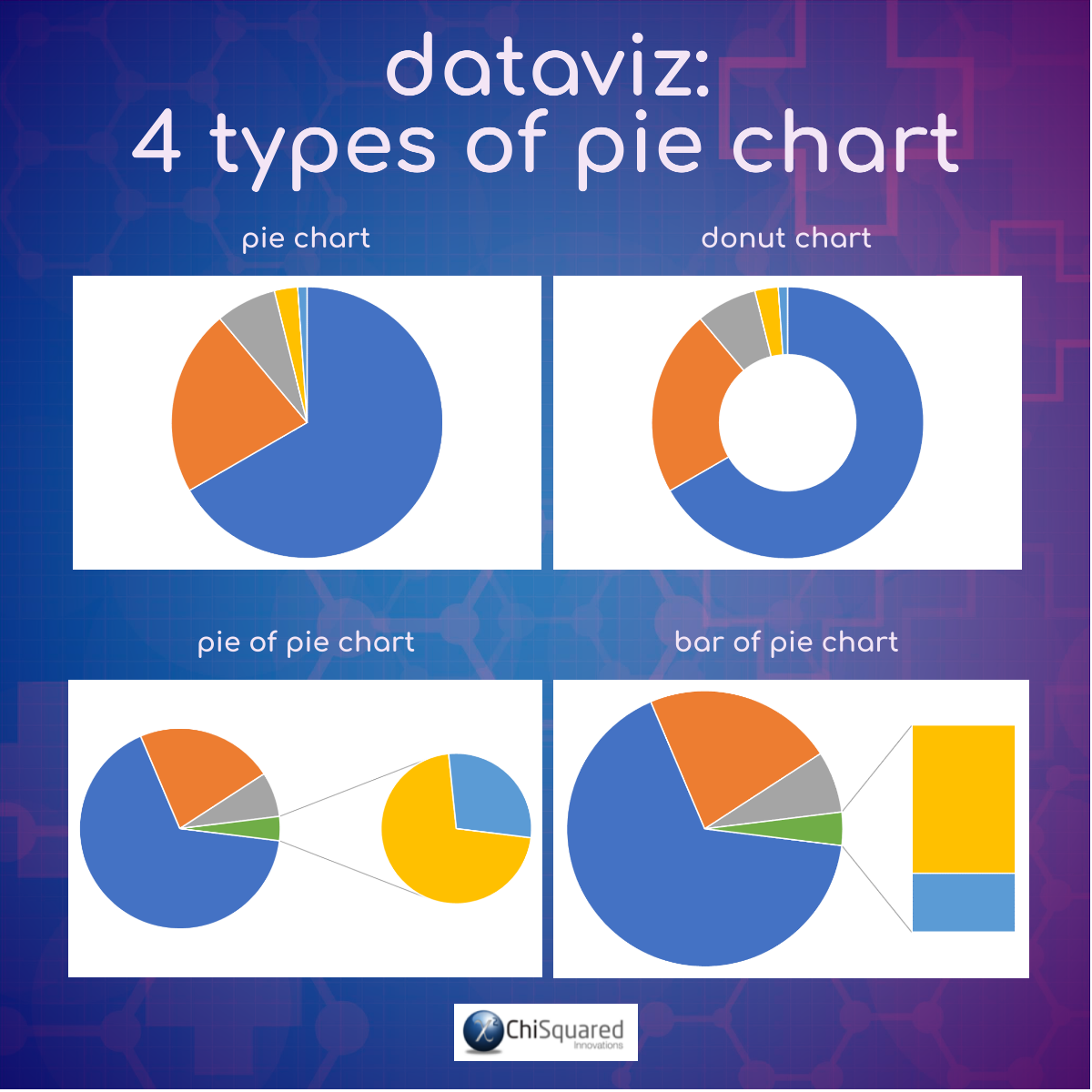
Pie Charts are used to show how categories represent parts of a whole and are used to show the composition of a variable, where the sum total of all segments sums to 100%.
When To Use Pie Charts
You can use Pie Charts when you want to compare the effect of one factor compared to the whole.
The Pie Chart is an alternative to a Column Chart; the x-axis is your categorical variable, and you can think of it as wrapping a linear axis round until it forms a circle – it is essentially a 100% Stacked Column Chart wrapped around into a circle. The height of the columns in the Column Chart then becomes the length of the arc in the Pie Chart.
As a general rule, if you’re unsure whether to use a Column Chart or a Pie Chart, most of the time you should choose the Column Chart.
Pie Charts - Learn More...
If you would like to learn more about Pie Charts - including the 8 rules to successfully using the Pie Chart - here is a much more in-depth article (opens in a new tab):
Box and Whiskers Plot
What does a Box and Whiskers Plot show?
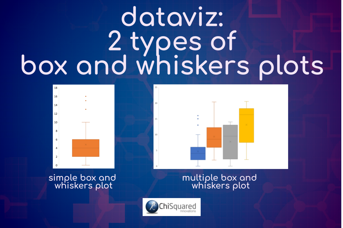
A Box and Whiskers Plot is a way of summarising a set of numerical data or comparing sets of numerical data. The Box and Whiskers Plot is used to show the shape of the distribution, the central value, the variability and outliers.
When To Use a Box and Whiskers Plot
You use Box and Whiskers Plots when you have multiple numerical data sets that are related to each other. They are used to provide high-level information at-a-glance and make comparisons between their distributions.
Box and Whiskers Plots - Learn More...
If you would like to learn more about Box and Whiskers Plots, here is a much more in-depth article (opens in a new tab):
Contingency Table
What does a Contingency Table show?
When To Use Contingency Tables
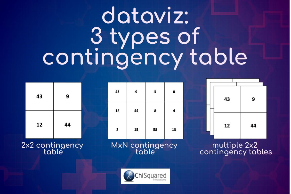
You use Contingency Tables when you have a pair of variables that are categorical, and they classify outcomes in rows and columns, where the cells at the intersections indicate how often both events coincided.
For example, if you had a Gender column [Male, Female] and a Breast Cancer column [Yes, No] of data, you would tally all the men that had breast cancer, and all those that didn’t, and do similarly with women. This would form a 2x2 Contingency Table (or matrix), which could then be analysed to determine if the likelihood of men getting breast cancer is different to that of women.
Contingency Tables - Learn More...
If you would like to learn more about Contingency Tables, here is a much more in-depth article (opens in a new tab):
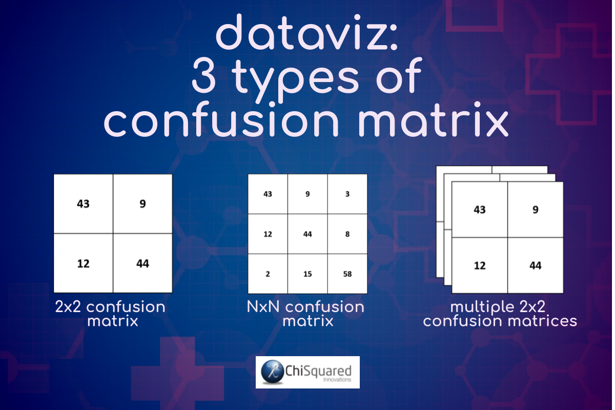
Confusion Matrix
What is a Confusion Matrix?
When To Use a Confusion Matrix
You use a Confusion Matrix when you have a model of some sort (statistical model or Machine Learning model) that is used to make predictions of a categorical variable. The outcomes are classified in rows and columns, where the cells at the intersections indicate how often the prediction matches the actual values.
For example, if you had a facial recognition algorithm that makes a prediction of Gender [Male, Female] from photographs, you would tally all the times that the algorithm correctly predicted Male and do the same for Female. Then you would tally all the times it was incorrect [Male-Female] [Female-Male]. These 4 prediction-outcome pairs would form a 2x2 Confusion Matrix, which could then be analysed to determine how accurate the algorithm is at detecting Gender.
Confusion Matrix - Learn More...
If you would like to learn more about the Confusion Matrix, here is a much more in-depth article (opens in a new tab):
Graph Tips – How to Choose the Right Chart for Your Data
Data is a collection of measurements or observations that represent the real world. On its own, data is useless. It just sits there and stares back at you, daring you to blink first. What you do with the data is important.
By interrogating the data and trying to understand it, you can transform the data into information that you can use to understand the world around you – and use it to predict the future.
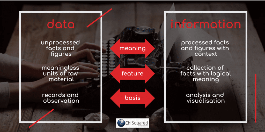
Information is your interpretation of the underlying story of the data. If you have collected data carefully with a view to accurately representing the real world, analysed it appropriately using the right tools and interpreted the results correctly, then the story you tell will likely have a strong basis in truth.
Knowing how to create charts in Excel isn’t enough, though, you need to know how to choose the right chart for your data so that you can present your results in the best possible light.
So, let’s go through a few useful graph tips to help you choose the right chart for your data.
3 Simple Questions...
What's Stopping You Reaching
YOUR Data Ninja Potential?
Answer 3 questions and we'll recommend the best route to
super-charge your data career
What is the story your data is trying to tell?
Fundamentally, data visualisation is about taking data and transforming it into a story that has the ability to change the world.
So start by asking these 2 questions:
- 1What kind of story is my data trying to tell me?
- 2How do I tell that story to others in a way that inspires them?
Once you have answers to these questions, you’ll be in a better position to choose the right types of data visualisation for your project.
Your data visualisation is probably the most important part of your presentation and deserves your utmost respect so take your time with it, make sure you’re following data visualisation best practices, and make it the best it can possibly be.
Ask others if they understand the story behind your chart without it needing further explanation. Ask them how your chart can be clearer.
And remember the quote from French author Antoine de Saint-Exupéry, who said:
“Perfection is achieved, not when there is nothing more to add, but when there is nothing left to take away”.
This applies as much to data visualisation as it does to writing.

Who will you present your results to? Know your audience!
Are you presenting your results to a panel for your PhD, a business audience or to a bunch of schoolkids? Your results might be the same for each of them, but how you present your results will be very different!
Take the time to find out about your audience and what their passions are. Then choose the types of data visualisation that invoke an emotional reaction that will motivate them to take action.
And remember data visualisation best practices – you still have to present your results correctly, using an appropriate chart for your data, otherwise you may unwittingly mislead your audience.
How big is your data, and how many data points will you display for each variable?
Some types of charts are meant to be used with small samples of data, while others are perfect for Big Data.
Make sure you choose a chart type that fits the size of your data set best and represents it clearly without clutter or confusion.
Graph Tips – The Do’s and Don’ts of Chart Plotting
So far, you’ve learnt about the types of charts and graphs in statistics and when to use them, but there are some other useful data visualisation principles that will help you to really pin down the story of your data, so that your audience will understand exactly what you’re talking about with just a quick glance of each chart.
Let’s go through a few graph tips – some do’s and don’ts of chart plotting to help you make the most of each and every graph.
Chart Complexity
Restrict the amount of information that each chart presents. You can always use additional charts.
Chart Junk
This refers to all the parts of a graph that are not directly related to the data or information being presented. If you’re presenting your charts to an academic audience, you’ll want to keep your chart junk to a minimum – preferably close to zero. Remove gridlines, unnecessary colours, data tables and labels. On the other hand, if you’re presenting your charts to a bunch of CEOs and other executives, add as much chart junk as you can – they hate data, but love 3D charts, unicorn sprinkles and magical fairy dust in presentations! *Groan*. But don’t blame me if it back-fires – some of them actually understand how to deceive with graphs!
Proportionality
The numerical values you plot should be proportional in size to the quantities presented. You do this so that a by-eye comparison of the sizes plotted (whether on a Pie Chart, Bubble Chart, Column Chart) would lead the viewer to the correct conclusion on the quantities without checking the axes. For example, if you had a Column Chart with columns of sizes 2, 4 and 8, the column denoting the 4 would be twice the size of the smaller column and half the size of the larger column. This means starting your axes from zero!
Sort Order
If you can, sort your columns, bars and pie slices in order of ascending value. This will make it easier to compare categories.
Legend
If you only have one category, you don’t need a legend – the chart title should be enough. When you need a legend, keep it close to the data. The reader shouldn’t have to keep moving their eyes away from the plot to read the legend.
Data Labels
Use data labels only when absolutely necessary. When you do, include labels only on those data points you’re specifically highlighting for discussion or comparison, and keep the labels close to the data points – don’t make your audience look away from the data.
Colours – Restrictions and Highlights
Restrict yourself to as few colours as possible. If you have a single series, you should use a single colour, but if you really do need more, you can use the same colour with different intensities (light to dark). You could highlight a single category with a different colour if it is critical to the story of your data, but only use one highlight colour per chart.
Colours – Series and Chart Limitations
Different series should be plotted with different colours, but bear in mind what happens when the chart is printed in black and white or when viewed by someone who is colour-blind.
Categorical Data
These are usually plotted on a Column Chart or a Bar Chart. For fewer than 4 or 5 categories you could use a Pie Chart (but you probably wouldn’t – I have still yet to see a situation in which a Pie Chart is more appropriate than a Column Chart).
Numerical Data
These are typically plotted as Line Charts or Scatter Plots.
Time Data
When you’re interested in how a variable changes over time, then time goes on the x-axis, plotted as a Column Chart or Line Chart. This is the most common situation with Time data. There are exceptions, though – if Time is your variable of interest (such as the time taken to run a race), then it would be better on the y-axis. You could still plot Time on the x-axis using a bar chart, but it would break convention. That’s OK – we all break data visualisation principles from time to time – just make sure your audience is clear on which variable you’re interested in.
Relationships
When you want to show the relationships between values in your dataset, you typically use a Line Chart, Scatter Plot or Bubble Chart.
Comparison
If you want to compare values, use Line Charts and Column Charts. When your pair of variables for comparison are both categorical, use a Contingency Table, and when you’re assessing a prediction, use a Confusion Matrix.
Trends
When you want to show trends in your data, you should use a Line Chart, Column Chart, Bar Chart or Scatter Plot.
Composition
When you want to show what variables are composed of, use a Pie Chart (few categories) or Stacked Column Chart (many categories).
DataViz – The Big Picture
Now let’s put together everything we’ve learnt.
For those times when you’re not sure how to choose the right chart for your data I have created an Ultra-Hi-Definition data visualisation flowchart, DataViz – The Big Picture, that will help you make good data choices.
The data visualisation flowchart is far too large to be shown here in all its glory, which is why I formatted it as a pdf for download as an accompaniment to this blog post . If you don’t yet have a copy, you can get it here:
FREE DataViz Flowchart

Master the Fundamentals of Data Visualisation
Ultra-Hi-Definition PDF
DataViz: How to Choose the Right Chart for Your Data
Here is an excerpt from the data visualisation flowchart DataViz – The Big Picture:
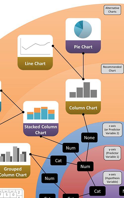
In DataViz – The Big Picture you start from the centre and work your way outwards to the rim, and follow the rules as we discussed here.
Let’s go through the steps again. You can use the acronym PRACRASS, if it helps you remember the steps, and there are 3 phases to follow:
- 1Data selection phase
- 2Chart selection phase
- 3Chart styling phase
Data selection phase
Step 1 – Predictor Variable:
Decide which is your Predictor Variable. This goes on the x-axis
Step 2 – Response Variable:
Decide which is your Response Variable. This goes on the y-axis.
Step 3 – Additional Variables:
Decide if you’re going to plot additional variables on the same graph, and whether they should be plotted on the x-axis or on a z-axis.
Chart selection phase
Step 4 – Chart Type:
Decide what type of chart you’re going to need (Comparison, Composition, Distribution or Relationship).
Step 5 – Recommended Chart:
Select the recommended chart.
Step 6 – Alternative Chart:
Consider whether an alternative chart might be better for your data and/or audience.
Chart styling phase
Step 7 – Simplify:
Remove everything from the graph that detracts from the story of your data.
Step 8 – Storify:
Add anything that enhances the story of your data.
DataViz: How to Choose the Right Chart for Your Data – Example
Let’s take an example and work this through the flowchart.
Let’s say you wish to see how the height of school children changes as they age. You have a variable, Age, arranged in decile categories (20s, 30s, 40s, etc.) and a second variable, Height. Height is measured as a numerical variable (not arranged in categories).
Which of these is your variable of interest?
This would be Height, the numerical variable. This is the Response Variable (because Height responds to Age, not the other way round) and goes on the y-axis.
Age, the categorical variable, is then the Predictor Variable, and goes on the x-axis.
We are not interested in adding in another variable, so we don’t need to consider a z-axis.
So, let’s go through the data selection phase:
Step 1 – Predictor Variable: Age is the Predictor Variable on the x-axis.
Step 2 – Response Variable: Height is the Response Variable on the y-axis.
Step 3 – Additional Variables: No additional variables.
Once you have completed the data selection phase, you move on to the chart selection phase.
Following the data selection steps on the excerpt above takes you to the recommended chart – a Column Chart.
Is this the right chart for your data?
You need to decide what type of chart you need to use. Are you wanting to show a Comparison or a Composition?
The answer here should be fairly obvious:
Step 4 – Chart Type: The chart type required is a Comparison Chart.
On the flowchart there are 2 possible chart types that fit this recommendation:
Step 5 – Recommended Chart: The recommended chart (Column Chart) is the best for these data.
Step 6 – Alternative Chart: If there are many categories, the best alternative would be a Line Chart.
Following the protocol into the chart styling phase, simplify the Column Chart as much as possible:
Step 7 – Simplify: Remove gridlines, use a single colour for all columns, remove all data labels, don’t use a 3D variant, etc., etc., etc.. If you have a technical audience, would error bars be appropriate? If so, calculate them and add them in, otherwise, leave them out.
Then add in information that helps tell the story of your data:
Step 8 – Storify: Add a descriptive title, informative axis titles and units, highlight specific data points that help to tell the story, etc.
When you’ve done all this, step back, take a deep breath and read the story of the data out loud, reading directly from the graph. Is something missing? Is there something there that doesn’t need to be?
Adjust and go again.
Ask a colleague to look at the graph and tell you the story of the data. Don’t give any clues and listen carefully. Did they miss something out? Did they misunderstand anything?
Adjust and go again.
Keep going until you have the perfect chart that conveys exactly the story of your data without the reader needing any additional information.
Do this for every graph, and I guarantee you will impress your boss!
Maybe even enough to get that next promotion…
Data visualisation is probably the sexiest part of statistics, but it’s also the part that is abused the most.
Despite data visualisation principles being very easy to follow, you only have to open a newspaper or turn on the TV news channel to spot graphs that have you shaking your head in disbelief.
If you haven’t done this before, I guarantee you’ll start doing it now – bad charts are everywhere!
And yet, it doesn’t have to be this way, if only the creator had followed a few of the data visualisation best practices outlined here.
Hopefully, by now you’ll know exactly how to create stunning and correct graphs, and will endeavour to do better, to be better.
After all, bad graphs put you to sleep, but great graphs have the power to change the world!
Pin it for later
Loved it?
Pin it to your favourite board!
Your DataViz Jump-Station
Ready for your next step?
You can use the following jump-station to choose the content you're looking for:
DataViz Jump-Station
This post is part of a series on the most used graphs in statistics.
For more detail, choose from the options below:
DataViz:
How to Choose The Right Chart for Your Data


